

Smart phones, tablets, and e-readers are everywhere nowadays. More people than ever before are using these mobile devices to browse the Internet. As a result of this recent trend, it is very important that websites follow suit and become responsive to mobile access. This goal can be achieved when a website is designed to respond correctly when accessed on a mobile device rather than a personal computer.
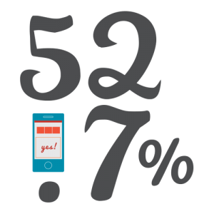
As more mobile devices are released onto the market, the importance of utilizing responsive web design for your website increases significantly. This year, the number of smartphone users in the United States is projected to exceed 207 million. That’s nearly 65 percent of our population. It is no surprise then that this recent trend in mobile technology has drastically increased the number of people that access the Internet mobily. According to www.statista.com, last year 52.7 percent of mobile phone users worldwide accessed the internet from their phones. That number is projected to increase by an additional 10 percent by 2018. With these numbers in mind, it is more important than ever to ensure that your website is responsive and user friendly for people surfing the web on their mobile devices.
Now that we have examined the demand that exists for responsive websites, it is important to be able to identify whether or not a website is responsive. There are multiple characteristics that comprise a responsive website.
- The first is adjustable screen resolution. Mobile devices are so variable in terms of size and functionality that it is important for a website to have the capability to adjust screen resolution across different devices.
- The second characteristic is flexible images. Aesthetics are a huge part of web design, and if images are not set up to be viewed in different profiles across multiple devices, then the website will not be as aesthetically pleasing.
- The third characteristic is user friendliness. It is very important to make the website easy for people to use and view on their mobile devices. Words need to be in a legible font, and need to be large enough for users to see on a small screen. Also, many mobile users will be interacting with these websites on touchscreens, so ensuring that they can select and scroll using this method is key.
With these characteristics in mind, it should be easier to identify a responsive website. If you’re still unsure whether or not your website is responsive, just follow this link https://www.google.com/webmasters/tools/mobile-friendly/ and plug in your website’s URL.
Although the number of responsive websites is constantly increasing, there are still many out there that are not yet responsive. Much of this is due to the fact that many companies either don’t have the knowledge or don’t have the budget to make their website more responsive. Well luckily, Creativetopia is here to help. If you’re ready to start your journey toward making your website more responsive, just give us a call at 615-656-7488 or email us at hello@creativetopia.com.