
The year 2017 was chalked full of design, development and more here in the Music City – Nashville. We have been thankful beyond measure for the work that has kept us busy and happy so much that we have been unable to groom our own grass (for example, write articles or publish our newest work.) Yes, we’ve been working hard and on some exciting projects! Stay tuned for our updates on what has been going on. If you have a website redesign project in Nashville and surrounding areas, we would love to talk. Stay-tuned!

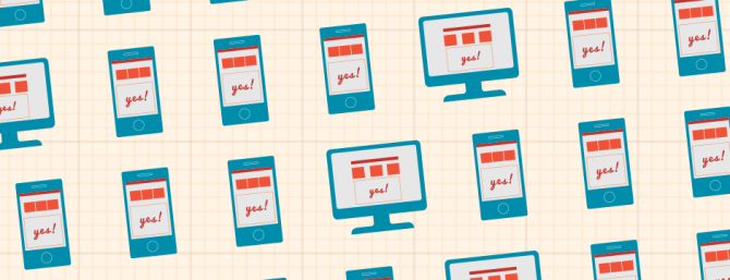
Smart phones, tablets, and e-readers are everywhere nowadays. More people than ever before are using these mobile devices to browse the Internet. As a result of this recent trend, it is very important that websites follow suit and become responsive to mobile access. This goal can be achieved when a website is designed to respond correctly when accessed on a mobile device rather than a personal computer.

As more mobile devices are released onto the market, the importance of utilizing responsive web design for your website increases significantly. This year, the number of smartphone users in the United States is projected to exceed 207 million. That’s nearly 65 percent of our population. It is no surprise then that this recent trend in mobile technology has drastically increased the number of people that access the Internet mobily. According to www.statista.com, last year 52.7 percent of mobile phone users worldwide accessed the internet from their phones. That number is projected to increase by an additional 10 percent by 2018. With these numbers in mind, it is more important than ever to ensure that your website is responsive and user friendly for people surfing the web on their mobile devices.
Now that we have examined the demand that exists for responsive websites, it is important to be able to identify whether or not a website is responsive. There are multiple characteristics that comprise a responsive website.
- The first is adjustable screen resolution. Mobile devices are so variable in terms of size and functionality that it is important for a website to have the capability to adjust screen resolution across different devices.
- The second characteristic is flexible images. Aesthetics are a huge part of web design, and if images are not set up to be viewed in different profiles across multiple devices, then the website will not be as aesthetically pleasing.
- The third characteristic is user friendliness. It is very important to make the website easy for people to use and view on their mobile devices. Words need to be in a legible font, and need to be large enough for users to see on a small screen. Also, many mobile users will be interacting with these websites on touchscreens, so ensuring that they can select and scroll using this method is key.
With these characteristics in mind, it should be easier to identify a responsive website. If you’re still unsure whether or not your website is responsive, just follow this link https://www.google.com/webmasters/tools/mobile-friendly/ and plug in your website’s URL.
Although the number of responsive websites is constantly increasing, there are still many out there that are not yet responsive. Much of this is due to the fact that many companies either don’t have the knowledge or don’t have the budget to make their website more responsive. Well luckily, Creativetopia is here to help. If you’re ready to start your journey toward making your website more responsive, just give us a call at 615-656-7488 or email us at hello@creativetopia.com.
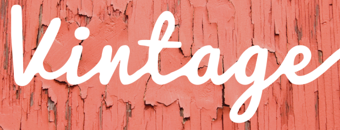
Vintage and Retro are swiftly spreading
From a Coca-Cola can, to a pair of shoes, to an online shop, you have seen it somewhere. Vintage and Retro designs are swiftly spreading across the plains of advertising again. These old style themes, previously considered to be outdated, are finally being dusted off and renovated with a little modern flavor. They are providing interesting and aesthetically pleasing designs that have increased attention by many.
The advantages to this trend are very direct and specific. Aside from its beauty, vintage design suggests qualities of experience, timelessness, and nostalgia- assets that make many products appealing.
Brands who have designed vintage:
- Coca-Cola
- Doritos
- Dodge
- Olive & Sinclair Chocolate Co.
- Willa’s Shortbread
Not everything is going full blown retro or vintage, but subtle inspirations can be found in a lot of recent advertising.
Common Old Style elements include:
- Retro illustrations from old print advertising
- Hand-Written typography and Script Fonts
- Imagery featuring old cars or television sets
- Black and white photography
- Neon colors and pop art
- Rough textures, such as old paper or wood
This resurge in design is positively affecting many businesses because of its friendly vibe and nostalgic impact on viewers. What do you think about this modern spin on old trends? Does it apply to the goals and style of your business?
Why we are willing to spend more on certain products
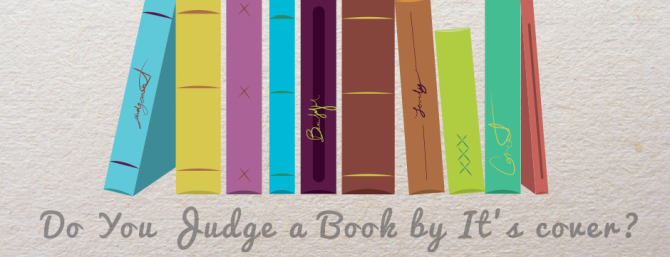
Have you ever been scolded for judging a book by its cover? Let’s be honest, weather we like it or not, we all do at least in the advertising world. When we are at the grocery store strolling the aisles of endless products on the shelves, which ones do we notice first? Almost every time, it is products that possess eye catching package design.
Packaging is the core of a product’s success. Generally, a product has approximately a five second window to catch a consumer’s attention before their eyes skip onto the next. If a consumer is attracted to the packaging, then they are more inclined to accept and like the product inside. This is why packaging design plays such an important role.
What ways does packaging attract our attention? There are design strategies that must work together to ensure the package represents the quality of the product. Colors and graphics generate immediate conclusions in consumers’ minds. For example, if a consumer is looking for organic tea, they may notice green packaging more quickly because most people associate the color green with natural.
Persuading a consumer to look at a product for more than five seconds is the first part of the goal, but persuading them to hold it increases the chances that they will buy it. This is why the shape and feel of the package must lure the senses in buyers. A uniquely shaped package indicates that the product inside is also unique. For example, a slender and tall package can suggest that the product is healthier than the stubby wide product beside it.
Subtle details like this may seem miniscule, but they play a major part in the way consumers subconsciously judge a product. Here are some well-known brands that have gained attention recently for their eye-catching packaging design.
Doritos and Coca-Cola
These renowned brands jumpstarted a revival on vintage packaging. By revisiting their roots and putting a modern spin on it, they increased nostalgia amongst its consumers. Doritos gained attention when they released a retro-style design for their Taco Flavor Chips. This is a redesigned version from the 1960’s that has remained popular. Coca-Cola has done the same with a majority of its packaging. Its throwback designs, representing that Coca-Cola has for over 125 years, have created an identity throughout the brand that celebrates its timelessness.
Tazo and Nivea
Other brands have cleaned up their package design with a more minimalist approach. With mostly white packaging accented with pops of color, they look more fresh, clean, and healthy. This trend has increased because of the modern appeal it encompasses over brands. Tazo’s beautiful collection of herbal teas stands out amongst its competitors with bright pallets aside neutral tones of text. While Nivea’s new simplified label design suggests hygiene and health.
What design qualities does your favorite products possess?
If you need assistance making your products or brand more attractive, we would love to help. Creativetopia designs for all your products needs to fit your brand and overall awareness in the competitive advertising world. We have the expertise to create beautiful and sleek design that will give an extra boost to your business.
Bringing Brands to Life with Style
Many assume that fine art and illustration are one in the same. However, this is not the case. Unlike fine art, illustration is a form of visual communication with the purpose of delivering, influencing, or advertising specific emotions and opinions. Some of the most memorable and successful advertising in the world have contained illustrations that stamped a lasting impression in people’s minds.
How exactly does an illustration do all this? Essentially, it needs a strong and appropriate style to support its content and goals.
The notion may sound simple enough, but there are countless ways to illustrate a single idea. So, how do you know what style would support the message you want to deliver to your audience?
The same concepts used in graphic design, such as line, color, and shape are taken into consideration. These details invoke a major influence in marketing because they ultimately effect how brands are perceived. The style is the personality of the brand in which marketers strive to make as appealing as possible. Like other design, the way illustration influences a message derives from its style and content. For example, if one were trying to convey an optimistic, happy, and warm message, they would most likely feature a bright yellow or orange in the illustration. Another example is if one were conveying nurturing, motherly, and peaceful messages, they would not feature sharp jagged edges and shapes.
A large part of the way individuals perceive and relate to graphics is based on personal experiences, however our modern culture has heavily influenced the way we relate to them as well. For example, the stereotype of blue and pink to differentiate gender in babies is widely accepted. Therefore, a feminine product such as makeup or lingerie, is more likely to feature pink than blue in its advertising because we are brought up from birth to identify and relate with certain colors.
These observations do not suggest a right or wrong way to decide on an advertising style. And there is not a specific formula to create a successful illustration, but being aware of these views when trying to establish your own unique brand is important. Creativetopia’s design experts are equipped with the knowledge to help you obtain the perfect style for your business advertising. If you would like help in stepping up your advertising strategy, feel free to give us a call. Visual communication is our specialty.
Different design suits different goals
After creating a strong identity and logo, what is next? If you are unsure of what imagery benefits your brand and supports your business goals, consider some basic options first. Try and ask yourself, what kind of design accessories support your logo, website, and other medias?
A main component of designing for your brand is imagery. Other design elements, such as layout, will come in later. Visual characteristics are the main way people remember and recognize you, especially in marketing. We are visual learners, so being interesting to look at is extremely important in a competitive environment. Imagery is not just an eye candy coating on top, it delivers your message in ways that written text can’t.
There are two main ways to represent imagery in print and online platforms: illustration and photography. Which kind will benefit your goals? Some companies use one or the other, but most utilize both. Illustration and photography can depend on many factors. They can convey a message, educate, and attract attention to a viewer each in their own unique ways.
Illustration:
Custom illustrations make it easy for viewers to understand extremely specific or difficult messages. They have the ability to simplify, yet get the information across every media. The advantages of illustrations are limitless, especially online. A clear and crisp illustration allows you to get information to viewers quickly. Users on average spend a few seconds looking at an ad before scrolling past. Almost any idea can be represented through an illustration because they are only limited by your imagination.
Major advantages of illustration
- Easy to customize
- Easy to modify
- Easy to update
- Easy to add or remove
- Do not need equipment or models
- Less expensive
- Easier to adjust for print
- Can expand across every platform and media
Photography
Photography allows you to focus on the quality of your product. If consumers see a beautiful high definition photograph, they are more likely to notice you over competitors. Food menus, fashion advertising, and products benefit the most from photography because people prefer to see it before they buy it.
Major advantages of photography
- Allows close attention to detail
- Can show the function of a product
- Makes consumers more comfortable about buying a product
- Photoshop can heighten and brighten your product
- Can influence strong emotions and opinions in viewers
- Can appeal to the other senses strongly: taste and touch
If you need help figuring out your next move in the advertising game, Creativetopia can help! We have the expertise to help you with your photography, illustration, and other design needs. Creating unique, eye catching content is our specialty.

Mascots are taking over social media.
Mascots have always been powerful branding tools. Now, thanks to social media, they have become a brand’s best friend. Social sites, such as Facebook and YouTube, are giving marketers a chance to develop character, storyline, and expression for mascots. Previously, mascots were limited to being featured in short commercials and packaging. Now, there is a limitless playing field to engage in with their own social media pages and sites.
Many brands, such as Spam, have recently created mascots specifically for the opportunity to go viral. Other brands, such as Planters, revamped their vintage mascots into witty animated spokespersons online. Mr. Peanut is now more interactive and engaging than ever before. M&Ms, Michelin, and Green Giant have also been giving their mascots more voice and face time on the internet.
Why is this trend taking over so abruptly? Marketers have noticed that consumers are more likely to follow and like a character with personality than a faceless product on social media. Statistics show that the most followed and liked brands on social media have mascots representing them. According to simplymeasured.com Progressive’s perky mascot, Flo, is leading this trend with over 4 million likes. Captain Morgan compares very closely with the highest percentage of fans that engage in their posts.
Leaders in this trend:
- Progressive
- Captain Morgan
- M&Ms
- Mr. Peanut
- Geico
To see more stats in these mascot races visit:
http://simplymeasured.com/blog/2012/05/02/social-media-showdown-5-top-brand-mascot-analyzed/
If you think a mascot could increase your brand awareness on social media, Creativetopia would love to bring it to life! Our designers have the imagination and skills to create a unique and memorable face for your brand. Or if your brand needs to be evolved for social media purposes, we can help with that too! What mascots do you follow on social media?

Standing out is the key to being recognized
There is a famous saying you may have heard, “if it’s not broke, don’t fix it.” That may be a good rule of thumb for some things, but in the competitive advertising world, standing out can give you the jump over others. More directly, just because something is known to work, does not mean it is what works best for your brand.
Everyone can recognize overused stock imagery such as the group of businessmen, the shaking hands, the smiling headset woman, or the high five jump. Sure, these images have worked for some, but they may not necessarily encompass a personable and unique message that your brand could be delivering. When viewers see a stunning photograph or illustration that relates to your brand specifically, it instantly becomes more memorable to them.
Not that all stock images should be banned, they are extremely handy when used suitably. We also realize that avoiding cliché imagery can be much more difficult than it sounds, especially when the imagery is what most people think of when they hear a name or word. However, avoiding the cliché can show just how innovative and unique your business is over the competitors. It is proven that creativity influences more thought provoking opinions and responses.
If you are considering breaking out of a generic theme or idea, Creativetopia would love to help! We thrive on pushing boundaries beyond the mediocre and helping you succeed.
Why are these mascots so influential towards their brands?
Mascots are making a comeback in the advertising world and they are offering a competitive advantage. Leading brands such as Nestle, Target, Disney, McDonalds, Pillsbury, Geico, Energizer, Mr. Clean, and Camel would not be as successful without such iconic mascots. They dramatically increased sales for these brands and have remained as household names for years. Mickey Mouse, now over 80 years old, has proven to be the most widely recognizable character in the world thus far.
Not every brand needs to have a mascot, but there are many reasons companies have them, especially if their brand focuses on children and parents. Mascots encompass a nurturing, playful, and trustworthy personality that appeals to this particular audience. When they are used as a spokesperson for the brand’s message, the product instantly becomes more interesting and interactive. Mascots such as the Nesquik Bunny, Tony the Tiger, and Toucan Sam demonstrate engaging and expressive qualities that stand out in a competitive industry. These particular mascots are breakfast characters that children become connected to, and ultimately influence their favorite breakfast cereals.
A large portion of mascots are geared towards children and parent audiences, but that does not mean they are limited to that audience in the least. Camel, Geico, Energizer, Mr. Clean, and many others aim for wider target audiences very successfully. The style and personality of these mascots range depending on the brand’s goals. However, the one quality that all mascots aim to achieve is trust. When consumers favor a mascot they are more inclined to trust in the product.
Mascots may seem old school, but they have the ability to be a powerful branding tool that increases value throughout the years. If you think a mascot would build your brand, Creativetopia would love to bring it to life! Our designers have the imagination and skills to create a unique and memorable face for your brand. If you already one, and would just like to evolve your mascot, we can help with that too!
These mascots are advertising veterans. How long have the faces of your favorite brands been in business?
- Mickey Mouse 1928
- McDonalds 1966
- Tony the Tiger 1952
- Mr. Peanut 1916
- Michelin Man 1898
- Pillsbury Doughboy 1965
- Mr. Clean 1958
- Energizer Bunny 1989
- Toucan Sam 1963
- Camel 1987
- Trix Rabbit 1959
To learn more about why mascots are returning so heavily, read A Brand’s Best Friend
You may benefit from one or two
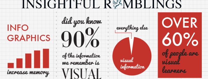
Infographics are a visual representation of complex information that allows viewers to receive copious amounts quickly. It has been proven that people remember information more easily through infographics because they test cognition in the brain. This is partly because 90% of the information we remember is strictly visual. Therefore, deem it important to make your visual mark when you consider the fact that an Internet surfer will see thousands of advertisements in a day. Utilizing infographics can be extremely helpful, especially if you are trying to reach out to people through the Internet. A user may be more inclined to listen to you if they find your information visually stimulating, educational, and entertaining.
Still not convinced that infographics can make an effective impact on your image?
Take these short truths into account:
- They are more captivating than a list of printed words because they possess color, motion, direction, and style.
- They deliver information quicker than body copy. Most people scan bodies of text and don’t read the majority of it unless they are already interested
- They reinforce a brand. If the infographic reflects the style of your brand it increases awareness overall.
- They are easily shareable, which can drive more people to your website.
Here at Creativetopia, visual strategy is our specialty. We can help you utilize all the advantages of infographics and incorporate them into all your business and advertising needs.